Tuesday, February 28, 2012

"May the Force Be With You..."

There is more to design than just interior spaces, or outdoor gardens.  A lot of design comes with invention.  The next best gadget that everyone must have.  It could be the new iPad or the "Snuggie."  People out there come up with an idea, then want others to think the idea is the next best thing.  In my search for new and fun designs, or things that inspire me,
I often come across some intriguing, and amusing concepts. 
And then there are those that just make you scratch your head and wonder, "Why?"


I myself don't really wear lipstick, but with this contraption all lipstick woes are over.  Just color in the lines and your lips will be as colorful as ever, ready to pucker up for that next kiss. 

Then we have the metal detecting sandles. 
This is for the treasure hunter, not somebody on probation.


The LED umbrella is next on the list.  Of course it reminds me of Luke Skywalker, becoming a "Jedi" master and leading the "Rebel Alliance" to defeat the "dark side."  It could be useful on those dark rainy nights when you are out and about.
Now you can decide if you think any or all of these designs are good or bad. 


This final "gadget" that I found, might just be interesting to some of you.
It is the "Orange Solar Tent" guarenteed to power all your wireless devices and even heat your sleeping surface.  It lights up at night and has an LCD touch screen inside.  Most people that go camping usually like to leave the technological world behind, but you never know, this could be the next trend in modern camping.

AVAILABLE NOW at
and coming soon to iTunes


Friday, February 24, 2012

Now This is Cool...


Everytime I see a slinky I can't help but be reminded of the log song from "Ren and Stimpy."
"What rolls down stairs, alone or in pairs, and over your neighbors dog?  What's great for a snack and fits on your back?  It's log, log, log!  It's log. It's log. It's big, it's heavy, it's wood. 
 It's log. It's log. It's better than bad, it's good!..." 
I'm sure youtube has a video you can watch to capture the true essence of the song. 
Really though, the design of a simple toy has gone to new heights. 
I am now going to introduce you to the slinky chair, also known as the "Flexible Love." 
It was designed by a Taiwanese college student out of recycled cardboard
and can seat up to 16 people.
I love using recycled products in design.  I love new innovations in design. 
Honestly I just love cool stuff!


Sunday, February 19, 2012

How Much?

Today I post about the ever rising prices of wonderful things.  I know sometimes when I find something that I like, the price is just way too much.  Then I don't like it as much.  So this time I want you to ask yourself, how much are you willing to pay for a design that you really appreciate?


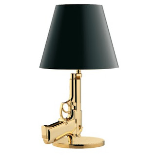
Is this a good design or a bad design?  How much do you think it costs?  I know the answer to the second question...it is $995.  Yep, you heard right.


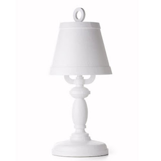
I think this is a cute little lamp.  It is actually made of wood and paper.
It's the paper mache of the 21st century.  It is under 18 inches tall, and yep you guessed it $1500.


I know many times I like the stuff that is on the pricey side.  That doesn't mean that I go out and purchase the exact item that I originally fell in love with.  The cool thing is when you find a design that intrigues your senses, you can often use the magic of the internet to find a more reasonably priced "knock off."  It doesn't have to be name brand to be a great design.

Thursday, February 16, 2012

Over the River and Through the Woods...


It started long ago.  The need to get from one place to another, but the destination was on the other side of a large canyon, river, canal, or ocean.  So, the bridge was invented.  The design was simple.  A couple of sticks and twine, and a whole lot of man power.


Then the design evolved.  There wasn't just a need for people to get to across the natural obstacle, cars needed to get across.  The function was the same, but the obligation changed. 
So, architects and engineers were brought in to create a bridge with substance and sustainability,
and let's be honest, allure and artistry. 


Tuesday, February 14, 2012

Out With the Old?...


There is something about recycling and reusing products that is intriguing to me.  I love taking something that is worn out, maybe cracked, maybe dented, and turning it into something unique and beautiful.  The table above is an old pallet that has been sanded and painted.  Add a couple of legs and a planter down the center and you have a fantastic little outdoor table.  Honestly, I would put this table indoors.  My design aesthitic is not biased.

Recycling and refurbishing old products and creating a design from such is right on trend in today's market.  People are thinking in a more "green" way.  Take the trunk table below: it's made from old tires.  There is storage and it's stylish.

Now , go out there and find something and turn it into a  groovy design...in fact (ready for the cheesiness) go create your own spark.

Friday, February 10, 2012

Kind of Like That...

Do you ever get excited when you want to redecorate a room?  You think about what you want to put in the room.  What do you want to be able to do in the room?  Then maybe you think of a style or theme you would like to portray.  The cool thing is that modern furnishings are going in every direction.  You can pick a table made of lucite.  Maybe you want to have a superhero theme for you kid's bedroom.  If you want to have a French theme it's not just adding accessories that say paris or have french words on them.  The important thing is to look at the style you wish to achieve.  Look at the commonalities in that style, then go shopping.  You don't have to go to the antique store anymore to achieve the same look.


In the time of Louis the IV and Louis the V, that cabriole leg was trendy.   It's the leg of the piece of furniture that is curvy.  Also it was about Baroque and Rococo.   Both had a lot of detail and scroll work.  They were fancy styles.  Baroque was more symmetrical as in this modern Bombe Chest below.


It's okay to mix styles a bit too.  The above chest is more  Baroque while the sconces and light fixture below are more Rococo.   Rococo looks very similar in the design, but is less symmetrical.  Still very curvy and fancy because in the time of Louis the V, it was about the fine things to decorate showing your power and success.  The fancier the better.


Still modern in the style of an antique, and you didn't have to go back to the 1700's to achieve it.


Thursday, February 9, 2012

I've Seen the Light...


There is something about lighting that can create a certain mood.  A lot of people think of lighting when it comes to photography.  In a darker image you can't see as many details.  It may even seem depressing, romantic, or creepy.


Not as many people think of using the right lighting when it comes to design.  Ask yourself what you need light for...

Are you trying to create a mood?  Maybe you are looking to create somewhere with high energy, like in this lighting concept for a nightclub.


It's good to remember these ideas when trying to create the right lighting for your space.  Lighter colors reflect the light.  Natural lighting combined with lighter colors open up a space, making it feel larger.  With regular incandescent light bulbs and natural lighting from a flame such as a fireplace or the light outside, a cozier, more homey feeling can be achieved.

If you are trying to create a romantic ambience or "darker" feel, add darker colors and use accent lighting such as recessed lighting around the perimeter of the room or sconces.  Adding a dimmer switch doesn't hurt either.  Sometimes just using small LED lights like in this picture of a home theater room  can create the same feel.
Don't be afraid to try out different ideas.  Lights and colors are your friends and make the design that much more appealing to look at.  Remember a good design is functional as well as aesthetically interesting and beautiful.
Now for a new trend..."chromatherapy" shower heads....
Do you want to take a shower with a different color every day?


Thursday, February 2, 2012

What in the world is that for?...

Sometimes when you see a design , you look at it and think, "what in the world is that?"  Then once the function reveals itself, you may think it is a clever, well thought out design, or an ineffecient mess.   When deciding if something is a good design or not, you need to decide if it fulfills it's purpose.  Do you know what the function is without the use of a detailed instruction manual?  Is it aesthically pleasing?  Does it perform it's function is a safe and effecient manner? 


In the case of the photo above of the "Ostrich Pillow," decide if it is a good design or a bad one.

I found the following design and had to share.  They are called "privacy shells" and the description is as follows: "Fashion accessories transform into beautiful shells of isolation that allow you to escape from the world for a couple of minutes."

I know for me, if I was wearing one of these things on my head, I would feel "isolated."
(enter sarcasm here)


For more info go to Andrea Lynn Design